Closet Sorting with SortMySwag
Conceptual App Redesign - Case Study
I began working on this web project back in 2017 called ‘SortMySwag’, and never got around to finishing it due to inconsistencies with the original concept. I decided it was time to iterate on this idea by doing a full redesign of the product, transforming it from a website into an interactive mobile app instead.
Overview
The idea behind the app is a place where you can upload your own possessions into an online database to keep track of what you own and organize your beauty supplies. I frequently found myself wishing there was a way I could keep this information on hand while I’m out shopping, so I decided to design it.
Tools:
Figma
Google Suite
Adobe Suite
Miro
Design Sprint:
Solo project
Interaction Design Specialty
Interaction Design
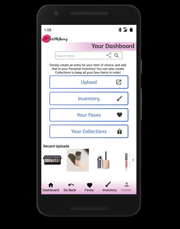
I really wanted to focus on interaction design for this project, as it became very obvious a handheld app was going to be much easier for users to access. A native app will allow users to use their phone’s camera to be able to take and upload pictures of their items quickly. So I needed to research what the best kinds of layout would be for a handheld app. I wanted to make sure the app’s interface had easily recognizable navigation and accessible selections for on-screen elements.
The Purpose
The reason I’m passionate about this project is because I found that I shared a common organizational problem that many people share, and I was eager to solve this problem. This was the first time I’ve designed a product where I was actually a part of the target demographic. This made for an interesting design process, as I wanted to make sure I wasn’t just designing the app for myself but for everyone.
User Research
I made sure to refer to the results of my user research to reduce design biases and focus on what the participants expressed the most need for. I performed a user survey, as well as an interview to gain both quantitative and qualitative data.
Deterrents:
Do not want to pay in-app fees (84.6%)
Would not use if the interface is too complicated (46.2%)
Users Want:
To prevent repeat purchases (69.2%)
To sort items visually (by color, brand, etc) (61.5%)
To share wishlists (38.5%)
To add reminders to their entries (38.5%)
85.7%
100%
Percentage of Interviewed users that would be interested in using such an app
Percentage of participants that forget about the beauty products they’ve collected over time
Percentage of participants that have never used an organization app
Minimum Viable Products
Upload an Item
In order for the app to be successful at its barest skeleton, being able to upload and delete items are essential.
Add Notes to Item
Building upon the skeleton, by being able to add a description to what you upload is essential for streamlined organization.
Add to a Collection
Being able to add individual entries into organized lists help users to keep track of their inventory in a optimal manner.
Sketches/Conceptual Design
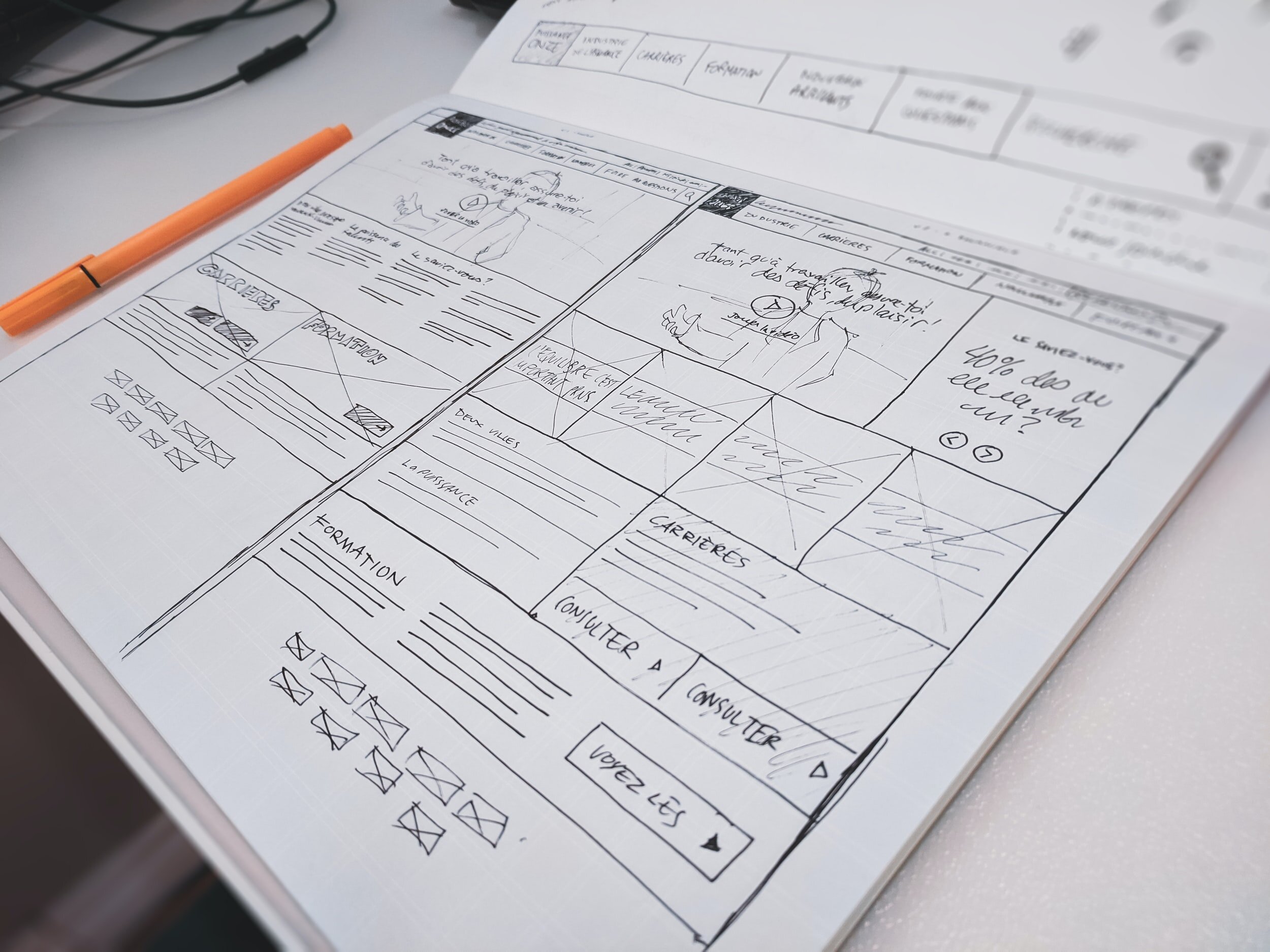
I quickly got to work sketching out how I wanted the mobile app to both look and to function. I knew it would be important to only focus on the basic structure for this design sprint.
User Flow
This user flow shows the task of adding an item from your inventory to a list, and then viewing your list. I wanted to be certain that I was providing ample opportunity for the user to be able to return to their inventory without navigational dead-ends. Click to view larger.
Live Prototype
View Interactive Prototype Here
Click the link so you can see a functional prototype of the app, created with Figma.


Feedback
Design Iterations
Added a separate faves section (previously Inventory and Faves were combined)
Allow tags to be added to items
Usability Testing
Some users didn’t understand the name (slang term)
87% of users found navigation intuitive
94% of users passed all user tasks successfully
Based off user insights and feedback, users were successfully able to interact with the app mockup easily. They understood what they needed to do, and did not find the process to be over complicated. I also made some iterations to the prototype itself, separating the Inventory from the Faves section for ease of access. These iterations were included in the Demo shared above.
Conclusion
Overall, I enjoyed this redesign because I was able to use the data acquired from testers to reinforce that the interactions I designed performed as intended. If I had had the knowledge to do user research back in 2017, I wouldn’t have run into nearly as many roadblocks as I did. I would love to continue building upon this concept over time.
Next Steps
Change the Name/Logo
A working profile page
Highlight navigation selections
Add a ‘Date Purchased’ field to notes
The next steps were decided in part from the feedback obtained from usability testing. The most immediate change I’d like to make would be to change the name of the app, after quickly realizing using slang terms in an app name wasn’t the brightest idea. ;)


